Sunday, September 28, 2014

In Pursuit of Personal Preferences, 4


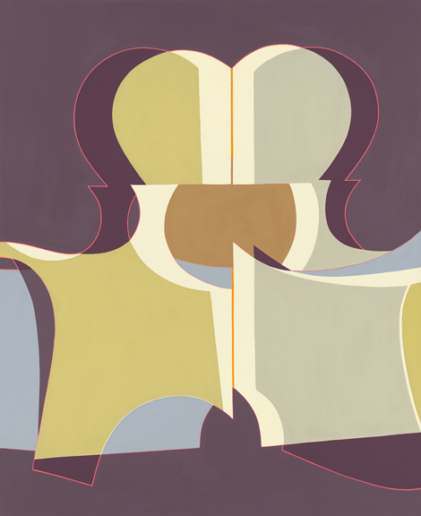
Origins of the Portuguese Paper Fetish 3
ca. 1960s, design by João da Câmara Leme
http://50watts.com/Origins-of-the-Portuguese-Paper-Fetish-3


Illustrations by Vladimír Fuka for "Nápady pana Apríla" by Jiří Kolář
(Prague, 1961)
114.3 x 114.3 cm
76.5 x 57.2 cm
SUE HEATLEY
http://50watts.com/The-Ideas-of-Mr-April

Can I just say how much I love giraffes. What I want to know is what defines this differently from animation/cartoon.


Louise Lawler
Still Life (Candle) (traced), 2003 / 2013
Signed certificate, installation instructions, match print on vinyl adhesive and vector based Illustrator file
Dimensions variable
http://drawingsandnotes.blogspot.com/2014_07_01_archive.html

This is a very cool illustration due to the fact that it is done with contour lines yet holds the integrity of the scene. It still seemingly has depth. The artist isn't afraid of the line but rather uses to express the items in a rather cartoon like way.


Natasja Kensmil
Sketches for official portrait (from serie WA 2013)
indian ink and conté on paper

This drawing is so layered that it leaves the viewer not lacking in new ideas. The three point perspective of the man's head gives it an almost a mythical look. Wither the author was aiming to give it this kind of effect or was just trying out different scotches is unbeknownst to me.


Untitled, 1995
Acrylic and marker pen on acetate in aluminum frame


Firelei Báez
Frenellos (aka new world order), 2013
acrylic and gouache on yupo paper
25.75 x 19.75 Inches
http://drawingsandnotes.blogspot.com/search?updated-max=2014-07-14T10:03:00%2B02:00&max-results=20
This was the inspiration to one of my drawing projects.


Raymond Pettibon
No Title (Sometimes if it…), 2013
Ink and acrylic on paper

http://drawingsandnotes.blogspot.com/search?updated-max=2013-11-20T10:17:00%2B01:00&max-results=20&start=20&by-date=false


Hans op de Beeck
Back, 2013
44 x 50,5 cm
I'm literally obsessed with this drawing. The shear detail is amazing.


http://www.theapproach.co.uk/artists/stezaker/
John Stezaker
Pair IV, 2007
Collage, 19.5x25.2 cm
This collage like photo is so interesting. It is almost more interesting and divers together then seperate.


http://www.milleryezerskigallery.com/portfolio/jowhara-alsaud/#http://www.milleryezerskigallery.com/wp-content/uploads/galleria/0cf39bcffefb6c6dfc4b4c0473ec3182.jpg
Hug
2010
C-41 Print Mounted on Aluminum
30 x 40 Inches


http://www.milleryezerskigallery.com/portfolio/catherine-kehoe/#http://www.milleryezerskigallery.com/wp-content/uploads/galleria/8f8fc55ae0c087b6f4e08f3c3d119728.jpg
Alabaster CompoteProvincetown Still LifePince ConeHeadPeoniesRed PlateThingsCassidyFrosty JuniorFrostyMy Uncle 2 (after Gilbert Stuart)Red Hat (after Vermeer)SP in natural lightSP with red glassesZero GSqueegee
Pince Cone
2012
Oil on Panel
10 x 10 Inches


http://www.milleryezerskigallery.com/portfolio/gail-spaien/#http://www.milleryezerskigallery.com/wp-content/uploads/galleria/f7efd79f2619dbfc55aed5ff8af88381.jpg
Still Life 4
2014
Acrylic on linen
30 x 34 inches


http://www.cynthia-reeves.com/ny-artists/george-sherwood/selected-works/slide:7

It would be really interesting to do a charcoal drawing or something similar to this and try to capture this depth. This is clearly a 3D structure is very different from a 2D pice of art. The other aspect of this is that it will always be different every time you look at it.


List of sites to visit, Week 4, 9/24/14

Museums:
http://www.lacma.org/art/exhibitions/current

Artist Blog:
http://50watts.com/
http://drawingsandnotes.blogspot.com/ http://www.theguardian.com/artanddesign/jonathanjonesblog+lifeandstyle/women -from Maddy

Galleries: 


http://drawingroom-gallery.com/contemporary-artists.shtml http://www.milleryezerskigallery.com/artists/
http://www.locksgallery.com/artists_rep.php http://www.cynthia-reeves.com/ny-artists

Artists: 


http://shariblaukopf.com/ http://afisherpaintings.net/ http://robertbaart.com/index.html http://laurabarnard.co.uk/ http://shariblaukopf.com/ http://carolgove.com/ http://dkim-art.com/

Videos:
http://www.youtube.com/watch?v=x7m19g5s4B8#t=37
http://www.thisiscolossal.com/2012/04/ephemeral-portraits-cut-from-layers-of-wire-mesh-by-seung-mo-park/

Sunday, September 21, 2014

Some Art to look at

https://www.facebook.com/talenthousefans/photos/pcb.10153117738444186/10153117737039186/?type=1&theater
French illustrator and art director David Troquier (Troqman) creates scrapbook doodles and place them into real life to create new layers of meaning. 


https://www.facebook.com/talenthousefans/photos/pcb.10153117201299186/10153117200589186/?type=1&theater
Portuguese artist Artur Bordalo (also known as Bordalo II) has created a series of street art over various train tracks throughout Portugal.
https://www.facebook.com/talenthousefans/photos/pb.34004904185.-2207520000.1411347527./10153117743624186/?type=3&theater
Filipino artist Joma Tuazon uses Faber Castell classic coloured pencils to create awesome portraits


https://www.facebook.com/talenthousefans/photos/pcb.10153117600634186/10153117599059186/?type=1&theater
https://www.talenthouse.com/billijincarle
Artist: Billijin Carle
kara-kuru kalem (dry pencil drawing) çizim ; 21x21 cm 2014 ... "Balloons life"

https://www.facebook.com/photo.php?fbid=625461680843570&set=oa.591693144218275&type=1&theater
Title: Striving For Glory
Artist: Dmitri Freund

Saturday, September 20, 2014

In Pursuit of Personal Preferences 3

In Pursuit of Personal Preferences


Simryn Gill (Singaporean, born 1959)
Where to draw the line
Date: 2011–12
Medium: Typewriting on nine sheets of paper
Dimensions: 40 1/4 x 74 3/4" (102.2 x 189.9 cm)
What is incredibly fascinating about this work of art is not merely the interesting layout but the interesting use of real essays written by the author, in this piece. "The typist was instructed to omit spaces, overtype any errors, and repeat words as necessary to fill nine long, scroll-like sheets." Thus the artist is really living up to the expression of reading between the lines. I feel like this art is highly metaphorical and I'm more interested in it's meaning then the mere layout.


http://www.moma.org/collection/browse_results.php?criteria=O%3ADE%3AI%3A3&page_number=54&template_id=1&sort_order=1


Untitled
Date: n.d.
Medium: Felt-tip pen on graph paper
Dimensions: 17 1/8 x 22 1/8" (43.5 x 56.1 cm)
Let's just be real this could be done by anyone make this piece of "art." Why did I put it down? Probably to focus on the fact that what we think of art is very subjective. Also because it feels like the cool start to another great idea.
http://www.moma.org/collection/browse_results.php?criteria=O%3ADE%3AI%3A3&page_number=152&template_id=1&sort_order=4


Figure in Movement
Date: 1913

Aleksandr Archipenko (American, 1887–1964)

Medium: Cut-and-pasted painted paper, conté crayon, and colored pencil on colored paper
Dimensions: 18 7/8 x 12 3/8" (47.9 x 31.4 cm)
What's cool about this drawing is it's simplistic method of representing a moving person. He uses geometric shapes as a way of saying this is the part is this size. Even with this method it still feels very representative of a person moving. Also the fact that the artist was able use different mediums and integrate it all into one piece is certainly fascinating. 


http://venetianred.net
Michele Sudduth— Duo 2014
Acrylic on canvas, 44 x 36″© Michele Sudduth

What is interesting about this artist is his ability to look at shapes, particularly puzzle pieces, and see "the humanizing aspects" of the image. The author uses both line drawing and solid colored shapes to be able to demonstrate what he sees. The noticeable lines, while not practiced by certain artist styles, demonstrates an almost equilibrium in the shapes.

http://www.moma.org/collection/browse_results.php?criteria=O%3ADE%3AI%3A3&page_number=201&template_id=1&sort_order=4

George Ault (American, 1891–1948)
Study for New Moon, New York
Date: 1944
Medium: Pencil on paper
Dimensions: 14 x 10" (35.3 x 25.3 cm)
This type of drawing aesthetically appeals to me both from it's use of liner perspective and its detailed but not too detailed approach. It is something I consider of more worth and at the same time Something I'd like to gain a better understanding of how to do it. The way light is represented is not with lamp posts but rather little erase marks. It is almost symbolically represented by theses lights of little beams. 


List of sites to visit, Week 3, 9/17/14


Museums:


Artist Blog:
           

Galleries:
http://www.davidrichardgallery.com/
http://www.elizabethharrisgallery.com/artists.html


Artists:

Videos:

Friday, September 19, 2014

A Poem for Jennifer


On wings of eagles you sore like a tooth brush
Holding fast to clean away your pain
Each metaphor shocks and alarms your cow
And Gryffindor is no more your enemy

A Rabbit holds fast the timer in his hand
It counts your very life span
But through experience this does not scare
Instead you humor him with a joke

A lick of the candle and Jack will jump over
He whispers a sweet melody in your ear
Aloha call out the natives
As they see this exotic creature

You bow and you curtsy but a wave would still do
As the crowds go wild by just looking at you
And they sing and they dance you a sweet little rhyme
As you somehow make out the end of the second stanza

Wednesday, September 17, 2014

My Drawings

9/16/14
Title: view of window at night.
Median: charcoal and Tempe on news paper print


9/17/14
Title: an old tree
Median: charcoal on some thick white paper.

Pursuit of Personal Preferences (PPP) 2

 Week 2, 9/11/14


http://eye-likey.blogspot.com/2014/07/a-visit-with-graphic-master-way-ahead.html
Artist: Imre Reiner
calligraphic style
Although it's not specified what materials are being used it looks like ink and markers are the primary mediums. It's really interesting to look at the clear cut style of the piece. The techniques employs a variety of shapes. It also looks like the direction and feel of each mark is quite different. There are thick and thin lines. What stood out to me the most was the use of the colors (orange, black, and white) in a simplistic way. The use of white page while in some cases off putting really fights to capture the viewers attention. 


http://eye-likey.blogspot.com/2012/05/check-out-these-list-illustrations-by.html
Check out these A list illustrations by Dante.
 Using picassoesque shapes + layered textures combined with line, he creates a sophisticated world all to itself. 

http://www.gallerynaga.com/?q=node/21

You Say Tomato and I'll Say Tomato, 2013, oil on canvas, 13x20" sold
This is a very weird yet interesting piece. The use of vivd colors both seemingly explains the oddity of the subject matter and almost demands the stylized choice. Clearly it represents a human expression and activity.

2014


2011
2012
2013


        http://www.zsaitsits.com/en/drawing/2011/
Artist: Stefan Zsaitsits

It's really interesting to see the progression of the art through the years.

Mortise, 2013, oil on panel, 48x36" sold
Millie #45, 2005, toned silverprint (1/5) 19x19"
Table Top #11 Carrot , 2014, ceramic, 7.5x7.5x1
http://www.gallerynaga.com/?q=node/35

This is a very simplistic subject yet the artist does a good job at adding detail but not too much detail. The atmospheric perspective and smothered material gives it the optical allusion of smog. I particularly like the feel of the lines. It's as if the artist's style is to paint in horizontal lines.

http://eye-likey.blogspot.com/2013/05/kevin-dart-illustrator-animator-about.html
Kevin Dart is an illustrator living in LA. 
This drawing is clearly made with three colors the fourth (white) most likely being the paper. Although it is not realist to a person it gives an almost interpretation of what this woman looks like.


http://www.gallerynaga.com/?q=node/41
After Martin Schongauer, Foolish Virgin #2
2008, woodcut, ink on paper, 35x23"

This is not a particularly appealing drawing to me. However it clearly has merit both from its detail and from the after effect that it leaves the viewer with. Its easy for the viewer to see the line and drawing marks yet it only adds to the detail of the piece.

http://www.gallerynaga.com/?q=node/43
I mostly picked this because I'm in a drawing class and this must be able to comprehend such pieces. This piece is very interesting in it's use of tones. It's not one of my favorite pieces but I'll give it credit for it's cloudily like feeling. This piece could be more emotional. For example a person could feel like they are falling into the abyss or something along those lines.

http://www.gallerynaga.com/?q=node/85
I just really like how this very detailed vegetable is on the weirdest thing ever, a plate. It is strangely symbolic for a person is most likely to see this in the kitchen, maybe even on a plate. The details also indicate an almost realism that the artist is trying to capture. 


http://www.pierogi2000.com/artists/michael-schall/#jp-carousel-1299
Remaking the Night Sky


http://www.tonyorrico.com/PENWALD_DRAWINGS.html
ony Orrico, 8 circles | Photo by Michael Hart


http://www.sangrammajumdar.com/early.html
The Complacency of Existence, oil on linen, 38 x 168, 2006 (private collection)

The Complacency of Existence, oil on linen, 38 x 168, 2006 (private collection)

Museums:
Artist Blog:
            http://eye-likey.blogspot.com/
Galleries:
           http://www.gallerynaga.com/
Artists:
http://www.joannegreenbaum.com/index.php
http://whitney.org/Collection/EdwardHopper

           http://www.saatchiart.com/account/artworks/616263