Week 2, 9/11/14

http://eye-likey.blogspot.com/2014/07/a-visit-with-graphic-master-way-ahead.html
Artist: Imre Reiner
calligraphic style
Although it's not specified what materials are being used it looks like ink and markers are the primary mediums. It's really interesting to look at the clear cut style of the piece. The techniques employs a variety of shapes. It also looks like the direction and feel of each mark is quite different. There are thick and thin lines. What stood out to me the most was the use of the colors (orange, black, and white) in a simplistic way. The use of white page while in some cases off putting really fights to capture the viewers attention.

http://eye-likey.blogspot.com/2012/05/check-out-these-list-illustrations-by.html
Check out these A list illustrations by Dante.
Using picassoesque shapes + layered textures combined with line, he creates a sophisticated world all to itself.

http://www.gallerynaga.com/?q=node/21
You Say Tomato and I'll Say Tomato, 2013, oil on canvas, 13x20" sold
This is a very weird yet interesting piece. The use of vivd colors both seemingly explains the oddity of the subject matter and almost demands the stylized choice. Clearly it represents a human expression and activity.
 |
| 2014 |
 |
| 2011 |
 |
| 2012 |
 |
| 2013 |
http://www.zsaitsits.com/en/drawing/2011/
Artist: Stefan Zsaitsits
It's really interesting to see the progression of the art through the years.

Mortise, 2013, oil on panel, 48x36" sold
Millie #45, 2005, toned silverprint (1/5) 19x19"
Table Top #11 Carrot , 2014, ceramic, 7.5x7.5x1
http://www.gallerynaga.com/?q=node/35
This is a very simplistic subject yet the artist does a good job at adding detail but not too much detail. The atmospheric perspective and smothered material gives it the optical allusion of smog. I particularly like the feel of the lines. It's as if the artist's style is to paint in horizontal lines.

http://eye-likey.blogspot.com/2013/05/kevin-dart-illustrator-animator-about.html
Kevin Dart is an illustrator living in LA.
This drawing is clearly made with three colors the fourth (white) most likely being the paper. Although it is not realist to a person it gives an almost interpretation of what this woman looks like.

http://www.gallerynaga.com/?q=node/41
After Martin Schongauer, Foolish Virgin #2,
2008, woodcut, ink on paper, 35x23"
2008, woodcut, ink on paper, 35x23"
This is not a particularly appealing drawing to me. However it clearly has merit both from its detail and from the after effect that it leaves the viewer with. Its easy for the viewer to see the line and drawing marks yet it only adds to the detail of the piece.

http://www.gallerynaga.com/?q=node/43
I mostly picked this because I'm in a drawing class and this must be able to comprehend such pieces. This piece is very interesting in it's use of tones. It's not one of my favorite pieces but I'll give it credit for it's cloudily like feeling. This piece could be more emotional. For example a person could feel like they are falling into the abyss or something along those lines.

http://www.gallerynaga.com/?q=node/85
I just really like how this very detailed vegetable is on the weirdest thing ever, a plate. It is strangely symbolic for a person is most likely to see this in the kitchen, maybe even on a plate. The details also indicate an almost realism that the artist is trying to capture.
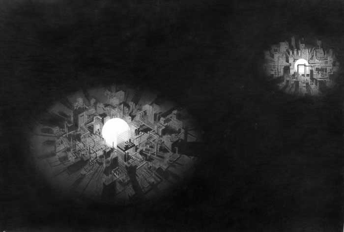
http://www.pierogi2000.com/artists/michael-schall/#jp-carousel-1299
Remaking the Night Sky
2008, Graphite on Paper, 41.25 x 59.75
This is mostly interesting for the composition of a majority black piece with a small town in two spots. The white ball looks either like a giant night light or more sorrowfully a bomb of some sort going off. If it was the latter it would have to be a more symbolic representation of what it is... out of place.

http://www.pierogi2000.com/artists/john-stoney/#jp-carousel-2654
View from West Point
2009, Colored pencil on rag paper, 41 x 30 inches
Private Collection
Let's just be real this is incredible for a colors pencil drawing. The minute detail is incredibly impressive and even though the back ground is farther away it still has an incredible amount of detail. This view has more depth of vision then I can see even with my glasses I think. There is also a feel of something deep and contemplative. The Artist for sure was able to pot ray a certain feel of emotion. 
http://www.pierogi2000.com/artists/daniel-zeller/#jp-carousel-6667
Internal Settlement
2014, Ink and acrylic on paper, 13.5 x 11 inches. Sold

http://www.adambaumgoldgallery.com
Grand Central, 2011, detail
Ink, watercolor on paper
60" x 48"
Grand Central, 2011, detail
Ink, watercolor on paper
60" x 48"

http://www.tonyorrico.com/PENWALD_DRAWINGS.html
ony Orrico, 8 circles | Photo by Michael Hart

http://www.sangrammajumdar.com/early.html
The Complacency of Existence, oil on linen, 38 x 168, 2006 (private collection)
The Complacency of Existence, oil on linen, 38 x 168, 2006 (private collection)
The Complacency of Existence, oil on linen, 38 x 168, 2006 (private collection)
The Complacency of Existence, oil on linen, 38 x 168, 2006 (private collection)
Museums:
Artist Blog:
Galleries:
Artists:
http://www.joannegreenbaum.com/index.php
http://whitney.org/Collection/EdwardHopper
http://www.saatchiart.com/account/artworks/616263
No comments:
Post a Comment